Opinion remains divided on a new city logo for Bainbridge Island.
The city council will take up the tortuous topic at tonight’s council meeting, where council members will be asked to pick between two final designs for a city logo.
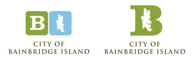
One design features a capital “B,” for Bainbridge, with an outline of the island inside the letter.
The other design depicts two squares; one with a capital “B” and in the other, an outline of the island.
The pair of possible logos were first presented to council members at their meeting on Dec. 8, and the council declined to pick one to replace the city’s longstanding logo (which features a ferry with forests and mountains in the background) that now adorns everything from city stationary to business cards and beyond. Instead, the council asked staff to get community feedback on the latest batch of possible logos.
But in emails received by the city since early last month, a clear favorite did not emerge.
Some people prefer the big B logo, while others, the two-square approach.
The big B logo received more positive reactions, according to email comments compiled by the city and shared with the council.
“It is a really nice logo that will remain appealing for a long time,” one person said of the big B logo. “The other logo makes me think of social media buttons and I worry that it will be outdated in a short period of time.”
“As far as the corporate logo goes, the two-square concept is unattractive,” added another. “The single ‘B’ with an island shaped hole is tolerable.”
One more vote: “I like the lone capital B with the island shape as the I inside. The other one with the blocks looks too childish, like toy blocks.”
Several who offered input on the new logos said the city should take a step back.
The new choices, said one islander, were “boring but not offensively tacky. I’ve lived here since 1975. What was wrong with the retro font ‘Bainbridge Island, WA?’ Simple. Why fix what wasn’t broken?”
“I have to say I like our city’s current logo more than either of these because it actually says something about us,” added another.
“I don’t see the need to switch the city logo, or the costs associated,” another commenter offered. “Many cities keep their logos forever and becomes a part of history. Being such a young city I don’t see the need for changing it. Hope the committee looks at the cost vs benefits of this requirement to change, and shares that with staff.”
Bainbridge had earlier hired an outside consultant, Arnett Muldrow & Associates of Greenville, South Carolina, for $22,545 to help “brand” Bainbridge Island with a new marketing logo for Bainbridge.
The logo effort included other materials to market Bainbridge Island in a coordinated fashion, but the unveiling of the consultant’s marketing logo in June was met with widespread criticism.
City officials soon said that first draft logo — a shield topped with a row of three medieval-style battle axes floating above wavy blue lines — would be dropped, and the city later terminated the contract with its cross-country consultants after subsequent logo designs also failed to find fans at city hall.
The newest designs were created by Bainbridge graphic designer Kelly Hume.
The council will meet at 7 p.m. Tuesday, Jan. 5 at city hall. The council discussion on the logo options is expected shortly after 8 p.m.