New city logo labeled a loser
Published 9:16 am Saturday, June 20, 2015
When you think of Bainbridge Island, do you think of a bunch of old battle axes?
That’s exactly what came to mind for the consultants who designed Bainbridge Island’s new logo.
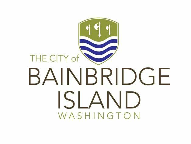
City officials hosted a “brand reveal” of a new marketing logo for Bainbridge Island last week, and the image — a shield topped with a row of three medieval-style battle axes floating above wavy blue lines — provoked so much immediate criticism, derision and ridicule across the island that it had city officials running to the ramparts.
Officials continued to try to tamp down controversy over the big dud of a design this week.
At Tuesday’s council meeting, City Manager Doug Schulze repeatedly told the city council and audience the proposed city logo was a first attempt; a work in process that was facing a major overhaul.
The axes have been axed, Schulze said.
“The input we’re getting early on is — definitely the axes will be gone. And we’ll probably move away from the crest altogether,” he said.
The logo, as well as other related promotional materials such as colors and letter fonts, were part of a marketing package put together by Arnett Muldrow & Associates to “brand” Bainbridge Island for visitors and locals alike.
The company, based in Greenville, South Carolina, has also conducted branding efforts for Port Townsend, Ellensburg and Wenatchee in Washington, as well as other cities across the country.
The city inked a deal with Arnett Muldrow & Associates in March in which the firm would be paid $22,545 to come up with a new logo and other branding materials that could be used by the city as well as the Bainbridge Island Chamber of Commerce and Bainbridge Island Downtown Association to promote the island in a coordinated fashion.
Input was extensive
Schulze said this week that the consultants had reviewed more than 200 surveys from community members, held multiple focus group meetings, took a tour of the island and met with many islanders before coming up with their “toolkit” of marketing materials, which included the battle axe logo.
The designs were unveiled last week at a special presentation at the Bainbridge Island Museum of Art to a less-than-thrilled crowd.
Schulze said this week the axes from the logo came from the crest of Commodore William Bainbridge (a U.S. Navy war hero and the island’s namesake) and the wavy lines, from the coat of arms for the city of Vancouver, B.C.
The axes, according to the consultants, was also a reference to the three times the island has been clear cut by loggers and the vow that today’s earth-conscious islanders would never let that happen again.
Schulze repeatedly stressed that the axe logo was an initial attempt.
“We fully expected that there would be revisions to what the consultants came up with in a very short period of time,” he told the council this week.
“They are very open to modifications and changes to this,” he said.
Besides the new logo for the city of Bainbridge, the consultants have also offered design ideas for custom banners and flags, “wayfinding” sign designs, advertising templates and other materials.
Schulze said other changes may also be made, including revisions to the consultant’s proposed lettering and font ideas.
Reaction to the color scheme proposed by Arnett Muldrow & Associates has been more favorable, Schulze noted.
Some praise for design work
While the overall work to create marketing materials that could be used to promote and brand the island drew the praise this week by Jerri Lane, executive director of the Bainbridge Island Downtown Association, and Rex Oliver, chamber president, as the designs will help Bainbridge businesses avoid a hodgepodge of different-looking promotional efforts, the reaction from others across the island has been harsh.
Critics lit up social media and blogs with complaints about the battle axe design, calling it “out of touch,” “cheesy, absurd and offensive,” “thrown together” and “hackneyed and graphically ugly.”
City officials started their hasty retreat from the battle axes late last week.
Schulze said the city is still accepting suggestions for modifications or changes, and added that public comment will be accepted through Friday, June 26.
The city manager also said that after suggestions are reviewed, the city could get a look at new designs in one to two weeks.


