New logo for park district
Published 9:00 am Wednesday, July 12, 2006
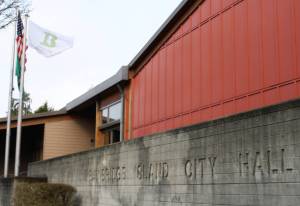
Metro district, nouveau logo.
The park district has a new symbol for its signs – fittingly, one designed prominently around trees.
“We’re trying to get a more identifiable logo, so people would see it and identify the district with it,†said Terry Lande, park district director. “Plus, we need ‘metro’ in everything now.â€
The new logo comes with the district’s recent transformation to the Bainbridge Island Metropolitan Park and Recreation District, a move that put local parks on permanent financial footing for the first time in nearly 40 years.
The district commissioned graphic design students at the Seattle Art Institute to submit new logo ideas. Eight designs were submitted, from which district staff winnowed two finalists.
The logo includes an abstract trio of green fir trees on a hillside, with a graphic brown arc overhead. It was selected by park commissioners at a recent meeting.
“It’s pretty cool,†Lande said. “Actually, the two finalists were both very, very cool.â€
AIS graphic arts students involved with the project were George Dubinin, Ching Leelaphisut, Sara Payne and Joe Yang, under the instruction of Melanie Menke.
“We presented our ideas and the ‘feel’ we were looking for, and they went from there,†said Georgia Browne, who coordinated the project for the district.
The logo will be phased into the district’s office letterhead, park signs and other locations over time.
But the district’s old logo will remain in at least one location – park employee Jack O’Neill carved it into the the stonework at the Strawberry Hill Park entrance, next to the driveway, in the early 1990s.